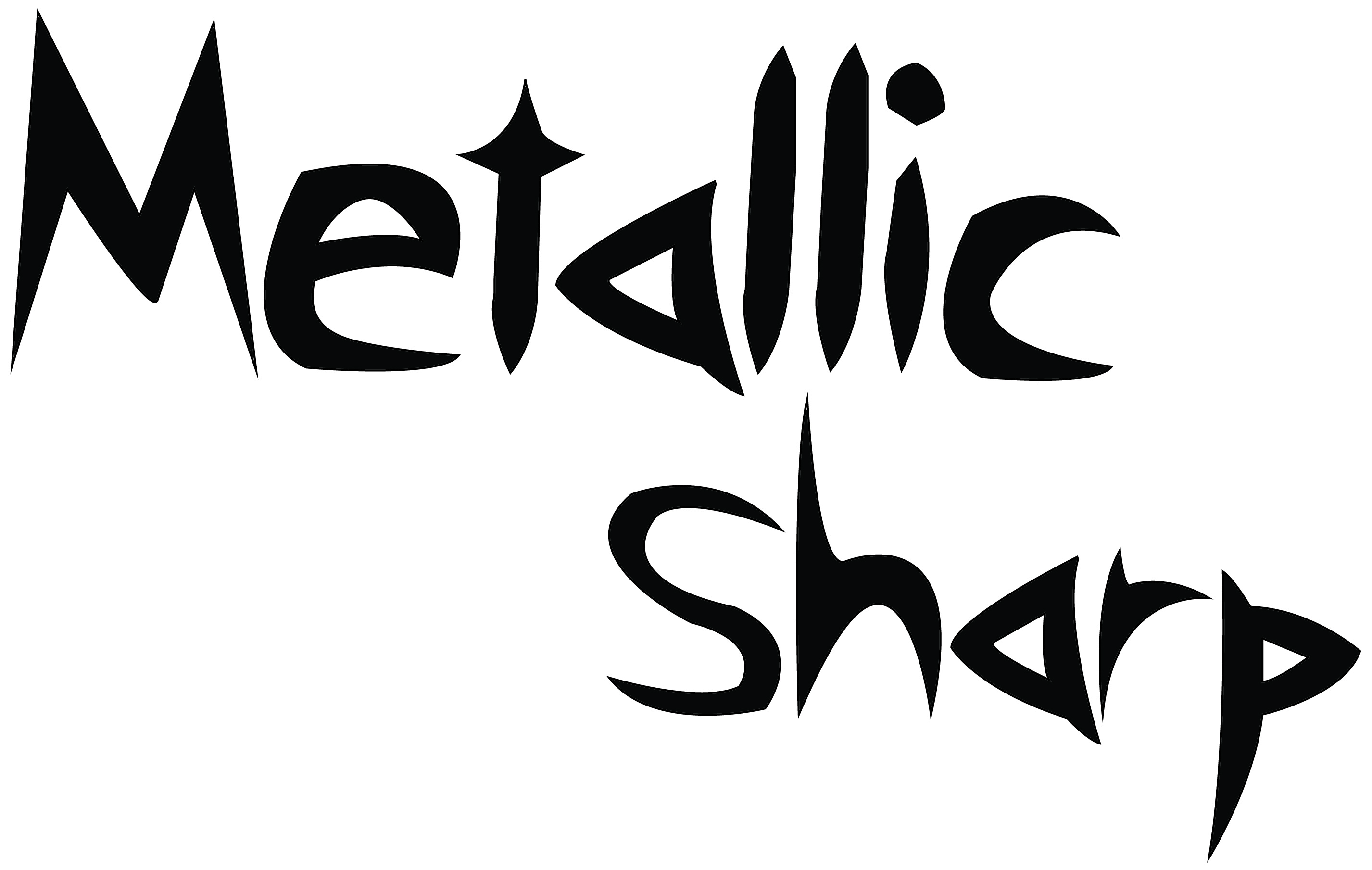
1. The name of my font is “Metallic Sharp”, and the reason why it’s called that is because I based it off the font the band “Metallica” uses and the ends of the letters are sharp and pointy. It’s a basic premise, but I think the name sounds cool.
2. The style of my font is pointed and jagged, not what I would call threatening. It just looks a little creepy, but I’ve been using it for a variety of different things for a long time and it’s just kind of stuck with me over the years. It has imperfections, but in a way that’s kind of the point. It’s almost supposed to stress the imperfections because of the overall look to the font.
3. Metallica has been one of my favorite bands for years and it always upset me that the words I could ever find in that font was the actual logo itself. So I guess you could say I expanded upon it and that’s basically it.
4. The way my font relates to my personality is that I’m kind of an odd person, not threatening. Just a little odd, but that’s why it seems to work.
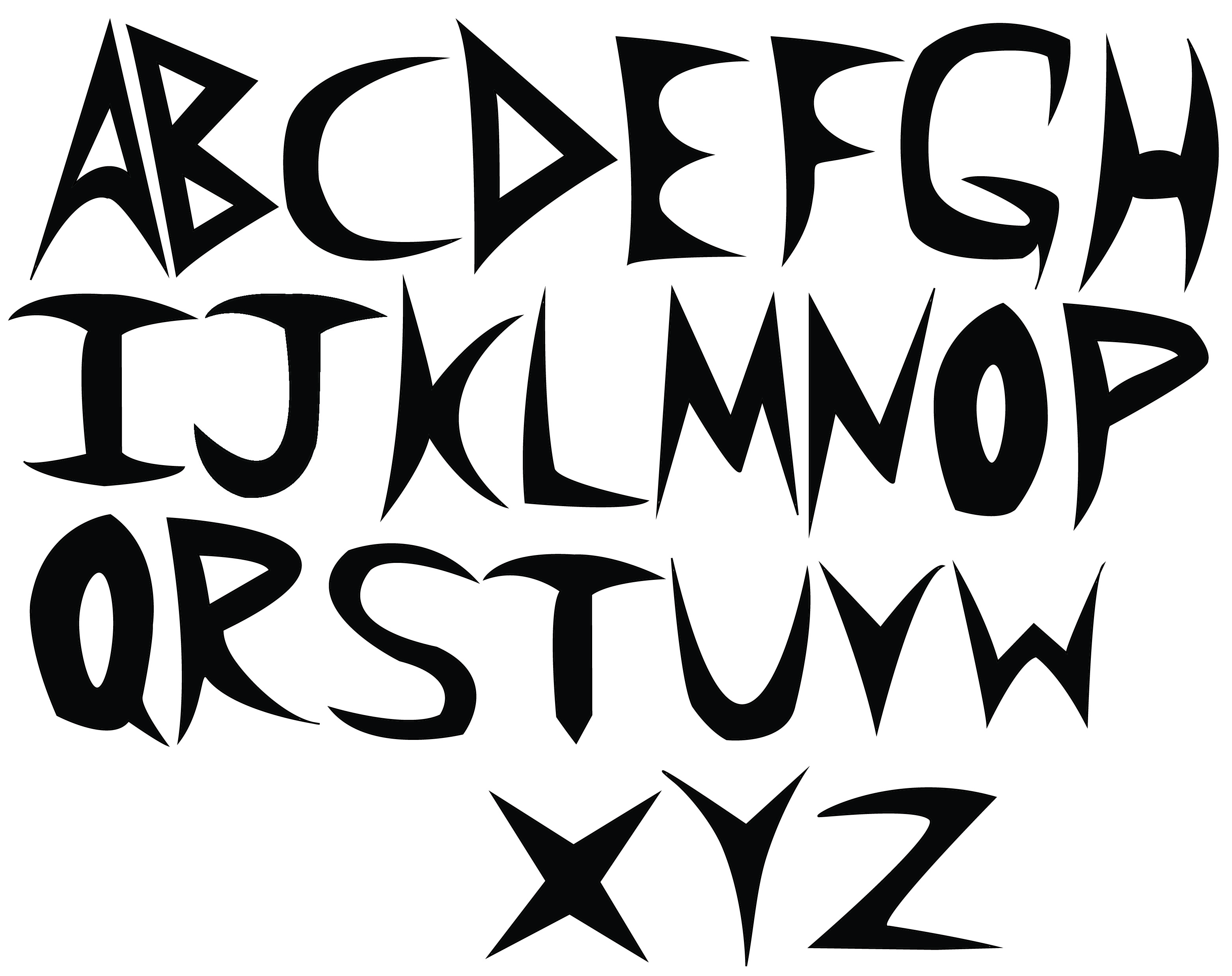
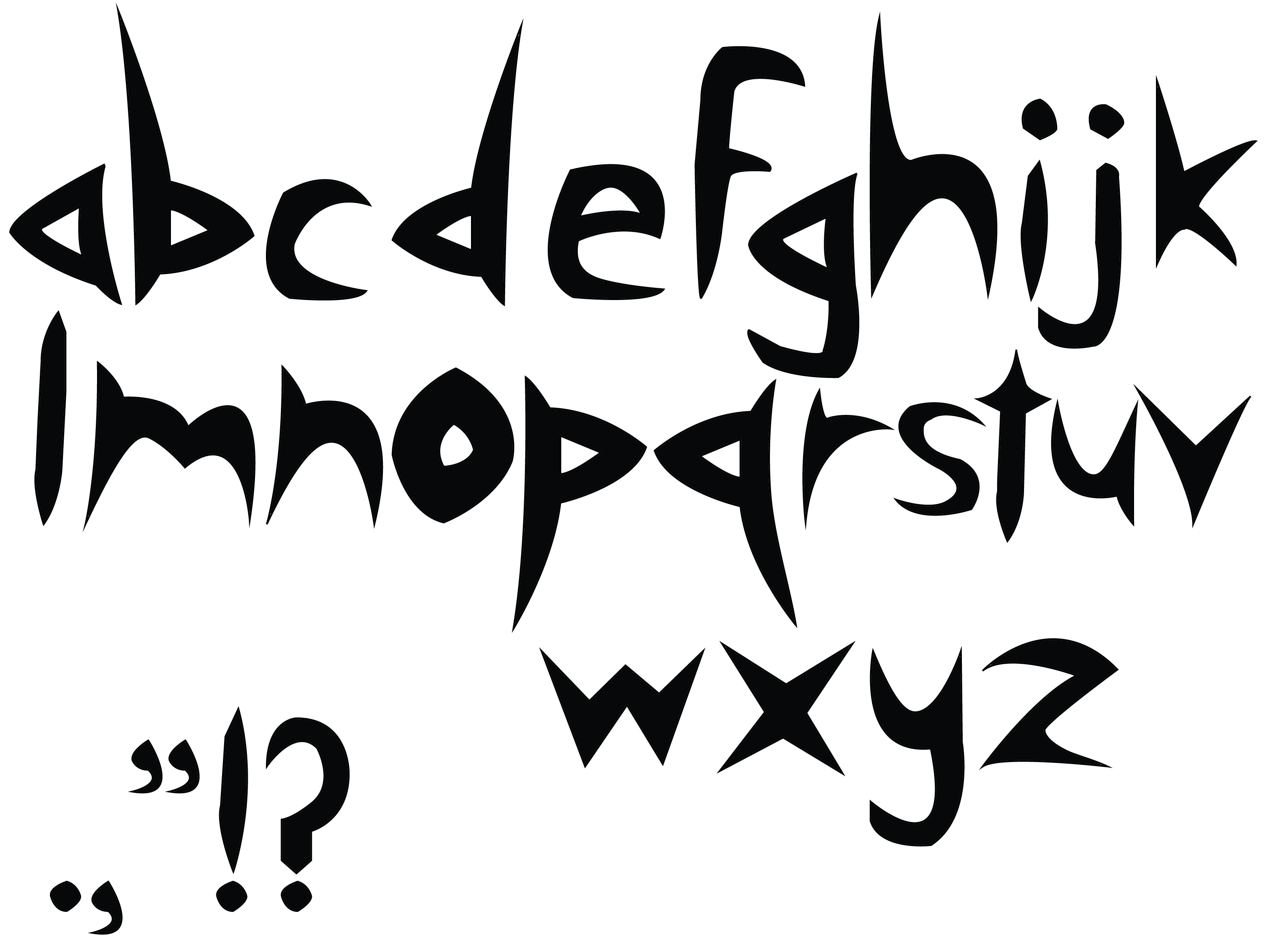
5. The most difficult part was probably creating the “S”, getting all the curvatures right and points on the end weren’t an easy task. Even now it’s not perfect, but it’s the closest I felt I got.
6. My biggest success was probably the whole set of capital letters. When I first started using the font, I pretty much only ever wrote in capital letters so it wasn’t difficult to recreate what I’d already been using for a while.
7. The second font would probably be a little more cute and harmless looking, so maybe in some kind of bubble letters or just puffy looking. It would be called “Cloud Wash” or something like that.
